


For the first time in more than 140 years, the world's oldest logo is updated.
Discover the historic redesign of Lyle’s Golden Syrup logo, blending tradition with modernity. Explore the evolution from the iconic lion surrounded by bees to a fresh, contemporary design, sparking mixed reactions.
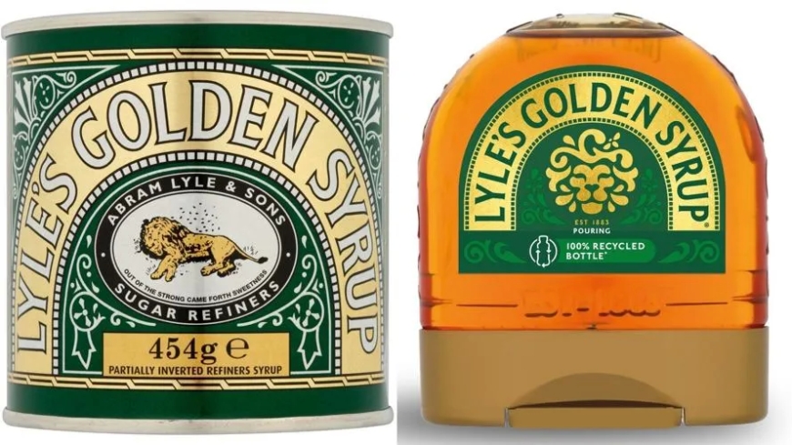
For more than 140 years, Lyle’s Golden Syrup has graced British pantries with its iconic tin featuring a unique emblem: a lion’s carcass encircled by bees. However, in a landmark move marking the first significant redesign since the 1880s, the Guinness World Records-acknowledged product is undergoing a transformative makeover.


This new visual identity aims to rejuvenate the brand's historic legacy, catering to a contemporary audience of the 21st century.
Golden syrup, or light treacle, a beloved sweet amber-colored syrup derived from refined sugar, originated from Abram Lyle & Sons in 1881. Inspired by the biblical tale of Samson, who discovers honeybees in a lion's carcass, the company's founder, Scottish businessman Abram Lyle, adopted this motif. The lion and bees symbolize strength and sweetness, respectively, echoing Samson's riddle from the Book of Judges.
The revamped logo retains elements of the original symbolism but presents a more abstract and dynamic depiction, with a solitary bee positioned above the lion's head.
While Guinness World Records recognized minimal alterations to the branding since 1885, such as technical adjustments during wartime, the 2008 introduction of a gold-colored tin marked a significant anniversary. However, the logo remained unchanged. The evolution continued when Tate & Lyle, formed from a merger in the 1920s, sold its sugar refining business, including Lyle’s Golden Syrup, to the US-based ASR Group in 2010.
The classic logo will persist on traditional golden syrup tins, while bottles and dessert toppings will showcase the new branding. However, the company has not disclosed whether this transition represents the majority of units sold.
James Whiteley, Lyle’s Golden Syrup brand director, emphasized the importance of brands evolving to meet contemporary consumer needs. The redesign aims to strike a balance between modern appeal and nostalgic authenticity.
Reactions to the redesign varied. Designer Laura Evans praised its contemporary simplicity, while some, particularly within Christian circles, criticized the departure from the original narrative's essence.
Revitalizing Tradition: Lyle’s Golden Syrup Unveils Modern Logo Redesign